
The other day I read this in-depth article on font usage in early DOS games by VileR. Since some of the fonts were apparently stored not as 1-bit bitmaps, but as multiple bits per pixel, I was wondering when the usage of multicolour fonts became commonplace on the PC.
I randomly thought of Lemmings as a game that I recall using a very nice and detailed font. But that turned out to be quite the can of worms, so I thought I’d write a quick summary of what we uncovered.
Now Lemmings was a game originally developed on the Amiga, and then ported to many different platforms. I mostly played the Amiga game back in the day, although I did also have a copy of the PC version. I had a vague recollection that although the Amiga version did look somewhat better, the PC version used basically the same font as the Amiga version.
Let’s compare the Amiga and PC version of Lemmings. And while we’re at it, let’s throw in the Atari ST version as well. More specifically, let’s concentrate on the VGA version of Lemmings for PC. Then we have three machines that have roughly similar video capabilities. All three machines have a video mode of 320×200, and support a palette that can be user-defined by RGB values. The Atari ST supports 3 bits per component (512 colours in total), the Amiga supports 4 bits per component (4096 colours in total), and VGA supports 6 bits per component (262144 colours in total).
The Atari ST supports 16 colours at once, the Amiga supports 32 colours at once (or 64 colours in the special ‘Extra HalfBrite’ mode), and VGA supports 256 colours at once. So at first glance, all three machines appear to have similar capabilities, with the Atari ST being the most limited, and VGA being the most capable. But now let’s look at how the game looks on these three systems.
First, the original on the Amiga:

Then the Atari ST:

Okay, looks very similar at first glance, although there is something I couldn’t quite put my finger on at first glance. But let’s look at the VGA version first:

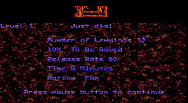
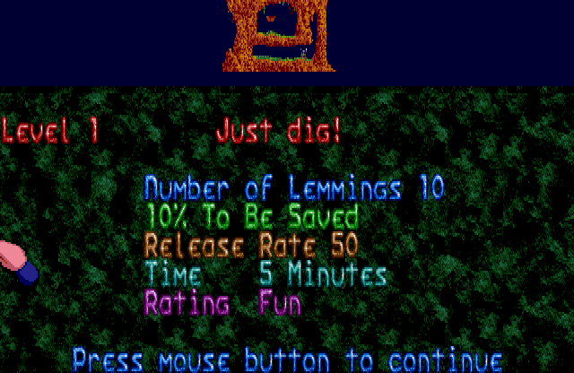
Hum, wait a second… When I look for screenshots on the internet, I also find some that look like this:

Are there different versions of Lemmings for PC? Well, yes and no, as it turns out. When you start the game, there is a menu that asks what machine type you have:

The first screenshot is from the game in “For PC compatibles” mode, the second screenshot is “For High Performance PCs”. So let’s call the first ‘lo’ mode, and the second ‘hi’ mode.
Okay, so let’s inspect things closer here. At first glance, the main level view appears to be the same on all three systems. That would imply that only 16 colours are used on all systems, otherwise the Atari ST would not be able to keep up visually with the others.
The only difference that stands out is that the Amiga and Atari ST have a blue-ish background colour, where the VGA versions are black. It’s not entirely clear why that is. Also, the blue background is used only for the level on Amiga, where the background is black for the text and icons. On the Atari ST, the background for the text is blue, and it only switches to black for the icons.
But then we get to the part that kicked this off in the first place: the font. On the Amiga we see a very detailed font, using various shades of green. On the Atari ST, we see a font that looks the same, at first glance (more on that later). On the ‘lo’ VGA version, we see a font with the same basic shape, but it appears to only have two shades: one green and one white.
The ‘hi’ VGA version however, looks different. For some reason, the font is not as high. Instead of the font filling out the entire area between the level view and the icon bar, there are 4 black scanlines between the level and the font. The icons are the same size and in the same position on screen, so effectively the font is scaled down a bit. It is only 11 pixels high, where the others are 15 pixels high. The font has more shades of green here: a number of 4 in total. Still less than on the Amiga (I count 7 shades there) and Atari ST (5 shades).
Okay, so there is something going on here. But what exactly? Well, we are being tricked! The game runs in a 16-colour mode on all three systems. However, if you inspect the screenshots closely, you will see that there are actually more than 16 colours on screen. As already mentioned, the font itself uses various shades of green. You don’t see that many shades of green in the level. That implies that the palette is changed between the level and the font.
This explains why the PC version has a ‘lo’ and a ‘hi’ version: Because VGA is not synchronized to the system clock, it is not trivial to change the palette at a given place on screen. While it is possible (see also my 1991 Donut), it will require some clever timer interrupts and recalibrating per-frame to avoid drift. So that explains why they chose to only do this on high performance PCs. On a slow PC, it would slow down the game too much. It also explains why there are 4 black scanlines between the level and the font. Firstly, because of all the different PCs out there, it is very hard to predict exactly how long the palette change takes. So you’ll want a bit of margin to avoid visible artifacts. Secondly, various VGA implementations won’t allow the RAMDAC to read the palette registers while the CPU is updating them. This can lead to black output or artifacts similar to CGA snow. But if all pixels are black, you won’t notice.
So apparently the ‘hi’ version does perform a palette change, where the ‘lo’ version does not. That means the ‘lo’ version can only use colours that are already in the level palette for its font. It also explains why the icons don’t have the brownish colours of the other three versions: the icons also have to make do with whatever is in the palette.
But getting back to the ‘hi’ version… Its icons still don’t look as good as the Amiga and Atari ST versions. We can derive why this is: we do not see any black scanlines between the font and icons. So we know that the ‘hi’ version does not perform a second palette change between font and icons. The Amiga and Atari ST versions do, however. On the PC, this wouldn’t have been practical. They would have had to sacrifice another few black scanlines, and the CPU requirements would have gone up even further. So apparently this was the compromise. That means that a single 16-colour palette is shared between the font and the icons.
Speaking of which, during the in-between screens, the VGA version also changes palette:
The top part shows the level in 16 colours. Then there are a few black scanlines, where the palette is changed to the brown earth colours and the blue shades for the font.
Mind you, that is still a simplification of how it looks on the Amiga:
Apparently the Amiga version changes the palette at every line of text. The PC is once again limited to changing the palette once, in an area with a few black scanlines. In this case, both the ‘lo’ and ‘hi’ versions appear to do the same. Performance was not an issue with a static info screen, apparently.
The Amiga uses 640×200 resolution here. The PC instead uses 640×350. That explains why the PC version has a somewhat strange aspect ratio for the level overview.
But getting back to the font and icons in-game. They do look a bit more detailed on the Amiga than on the Atari ST. And it’s not just the colours, it seems. So what is going on here? Well, possibly the most obvious place to spot it is the level overview in the bottom-right corner. Yes, it has twice the horizontal resolution of the other platforms. Apparently it is running in 640×200 resolution, rather than 320×200.
That explains why the icons look slightly different as well. They are a more detailed high-resolution version than the other platforms. And if we look closer at the font, we see that this is the high-resolution font that is also used in the other screen.
The Atari ST cannot do this, because it does not have a 640×200 mode that is capable of 16 colours. And for VGA, as already said, it’s not possible to accurately perform operations at a given screen position. So if you can’t accurately change palettes, you certainly can’t accurately change display resolution.
So there we have it, three systems with very similar graphics capabilities on paper, yet we find that there are 4 different ways in which the game Lemmings is actually rendered. Clever developers pushing the limits of each specific system.
I suppose the biggest unanswered question is: why does the VGA version have this limitation? Worst-case, you have 3 palettes of 16 colours on screen, which is 48 colours. In mode 13h, you can have 256 colours, so no palette changes would be required. Instead the developers appear to have chosen to use the same 16-colour mode for both EGA and VGA, and only improve the palette for the VGA version. This may be because they use EGA functionality for scrolling and storing sprites offscreen. In mode 13h you wouldn’t have that. You’d have to perform scrolling by copying data around in memory. That may have been too slow. And perhaps they weren’t familiar with mode X. Or perhaps they tried mode X, but found that it was too limiting, so they stuck with EGA mode 0Dh anyway. Or perhaps they figured they’d need separate content for a mode X mode, which would require too much extra diskspace. Who knows.
